

Perfume Bottle Vendor Insights for Building a Distinctive Fragrance Brand
2026-11-21
Most fragrance brands obsess over the liquid, but the bottle is what buyers notice first. Drawing on perfume bottle vendor insights, this guide looks past surface-level trends to examine the details that make a fragrance brand distinctive: glass weight, cap fit, finish consistency, and the small design cues that signal quality before a single spray. Instead of settling for another generic shape, you’ll learn how supplier choices shape brand perception and why switching from catalog bottles to a more intentional approach can change how customers remember you. Whether you’re launching a first scent or refining an existing line, the right production partner matters. That’s where Imagine Craft Packaging comes in, helping turn vendor knowledge into packaging that feels unmistakably yours.
What Bottle Makers Wish Emerging Fragrance Brands Knew Before the First Order
The first thing most bottle makers would tell a new fragrance founder is that you are rarely ordering a bottle; you are commissioning a mould. A silhouette you saw on a mood board might need a completely new finish, a different shoulder angle, or a thicker base just to survive your filling line, and each of those changes comes with tooling time and cost that no amount of rush fees can fully erase. It is far cheaper to adapt an existing house mould with a custom cap, coating, or label than to open a new mould for a shape that is only marginally different from something already sitting on the shelf.
Samples also deserve more respect than they usually get. A hand-finished pre-production sample can look flawless because someone buffed the seams and sprayed it under ideal conditions; production glass will cool, anneal, and travel differently. If you skip a second round of sampling to save three weeks, you risk discovering the colour shifts under your label adhesive or the neck finish does not seat the pump cleanly only after the pallets have cleared customs. Bottle makers would rather extend the timeline before the first order than rework an entire run afterward.
The least glamorous part of the process is the spec sheet, but that is where most first orders fall apart. You need the neck finish, thread form, shoulder clearance, base push-up, and label panel dimensions agreed before tooling begins, and they have to be tested against the actual cap, pump, collar, and filling line components—not just the CAD renders. Tell the maker about the fragrance concentrate, especially if it contains high ethanol, strong solvents, or unusual oils, because some external coatings and adhesives behave badly with certain formulas. And clarify who owns the mould, what the minimum reorder quantity is, and what happens if a cavity wears out; those terms are easier to discuss before money moves than after a production delay.
Reading Vendor Portfolios Like a Creative Director, Not a Buyer
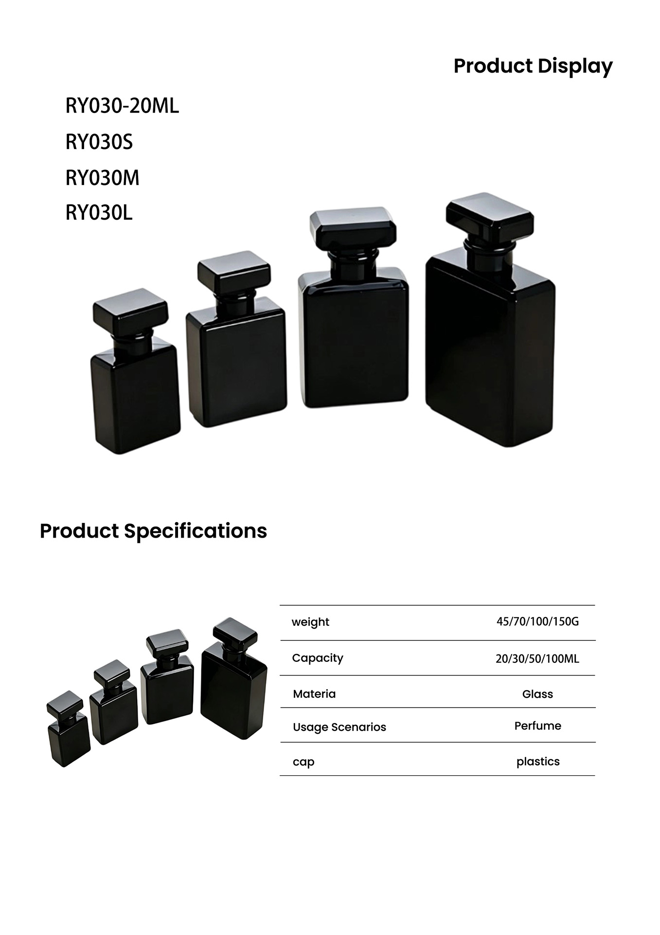
Most people open a vendor portfolio and immediately hunt for logos, deliverables, and categories. A creative director tends to flip past that surface. The first thing worth noticing is whether the work has a point of view: does each project feel inevitable for that brand, or could it have been made for anyone? That distinction shows up in small, unglamorous choices — how a headline sits against an image, how a color gets repeated, how a layout recovers after a dull page. None of these details appear in a capability list, but they tell you whether the vendor can make decisions when the brief gets fuzzy.
It also helps to read the portfolio for rhythm, not just range. A buyer wants proof that the team has done the exact same thing before. A creative director looks for a thread — a recurring instinct for tension, tone, or restraint — because that thread is what you're actually hiring. You can teach someone your category, but you can't easily teach them to notice when an idea is almost right instead of right.
Try ignoring the case study summaries on the first pass. Just look at the work in silence and ask what it made you feel. If the answer is nothing, no amount of process diagrams or testimonials will fix that. If the answer is a slight, specific emotion — envy, discomfort, curiosity — that's a stronger signal than any ticked box.
Material Choices That Signal a Fragrance's Personality Before the Cap Comes Off
A thick, cool slab of glass does more than sit heavily in the hand. It slows the ritual down, making the scent feel dense, deliberate, and a little formal. Matte ceramic has a drier presence, quietly promising powder, skin, or faded woods, while polished transparent walls act like a bright corridor for sharper citrus, aldehydes, or wet green notes. The temperature of the material matters too: something that holds cold against the palm often reads as reserved or mineral, whereas a warmer, softer surface suggests a fragrance with more diffuse, intimate edges.
The cap is the first tactile handshake, and it usually gives away more than the bottle. A chunky wooden stopper with visible grain points toward dry tobacco, vetiver, cedar, or amber, almost before the juice has a chance to speak. Brushed metal feels icy and precise, hinting at synthetic freshness, marine notes, or something engineered rather than extracted. Even a thin layer of cork or rubber changes the expectation: it introduces a muted, slightly odd friction that makes a sweet floral or fruit feel less pretty and more lived-in.
Some bottles become memorable by working against those instincts. Rough concrete paired with a delicate white flower creates a tension that signals the scent will not be purely soft. Glossy lacquer over an unexpectedly heavy shell can make a gourmand feel more nocturnal or harder-edged. In these cases, the material choice is not decoration; it is a quiet piece of editing that tells you whether the perfume will lean clean or dirty, bright or brooding, before the cap ever comes off.
Building a Bottle Identity That Cannot Be Mistaken for Another Label
The bottle was designed to be recognized by touch before anyone reads a word. The glass has a flat chamfer running down two sides, just wide enough to catch a thumb, while the label is printed on stock with the grit of a matchbook cover. In a row of smooth, high-gloss competitors, that slight friction immediately signals a different maker.
A single vertical rule cuts the label off-center, and the logotype sits deliberately low, closer to the base than the neck. This creates an awkward pause most brands would correct. That hesitation is the point: it makes the label look like a deliberate piece of typography rather than a centered template, and it is almost impossible to replicate casually.
There is also a hidden inconsistency in the production run. The color on the cap shifts slightly from batch to batch because the metal is dyed in small, uneven lots. No two bottles are exactly alike, so the identity lives in that variation as much as in the fixed layout. A counterfeit would have to copy the imperfection, not just the design.
Negotiating Minimums and Lead Times Without Diluting the Design Vision
The instinct to protect a design often shows up as rigidity, but the most useful move is to treat a supplier's minimum order quantity as a material constraint rather than a rejection. For example, a textile mill might demand 300 meters when the project only needs 80. Instead of swapping the specified weave for whatever is stocked, ask whether the same fiber can be ordered undyed and finished in a smaller batch, or whether the mill will hold the remaining yardage against a future run. That keeps the visual language intact while shifting the negotiation from yes-or-no to how.
Lead time is usually where the design loses its nerve. A compressed calendar gets blamed for downgraded details, but the real issue is usually sequencing. If you can separate the parts of the design that require long-lead sampling from the parts that only need final approval, you create room. Custom hardware might need twelve weeks, but the upholstery frame can be locked earlier. Negotiate for a split delivery schedule or a sample-first commitment, so the final product doesn't quietly inherit an off-the-shelf substitute because time ran out.
The strongest leverage comes from proposing alternatives that protect the silhouette, proportion, and material logic. Offer to simplify the construction in invisible areas—inside joinery, pocketing, underside finishing—in exchange for keeping the visible seams and edge profile exactly as drawn. Ask the supplier what minimum would become possible if panels were cut from a stock sheet size with less waste, rather than from a custom dimension. Those trade-offs read as fluency, not capitulation, and they often produce a design that feels more resolved under constraint.
Turning Packaging Constraints Into the Story Your Brand Is Remembered By
A tighter box, a thinner liner, a label that has to share space with a recycling symbol—these are rarely seen as creative gifts. Yet when a brand stops treating packaging limits as obstacles and starts treating them as clues, the container becomes part of the product’s memory. The constraint tells you what to leave out, and that omission often says more than a bigger budget would.
Maybe the cardboard is uncoated because the client insisted on curb-side recyclability. That tactile grain can become the signature: a surface people want to touch before they open the box. A smaller footprint might force a sharper message, one sentence instead of three. The result feels deliberate rather than reduced, as if the brand chose restraint on purpose.
The story gets remembered when the limitation is made visible or even celebrated—an exposed seam, a single ink colour, a die-cut window that frames only what matters. These decisions don’t announce the constraint; they quietly turn it into a reason to believe the brand knows what it values.
FAQ
Look beyond catalogs and price sheets. A vendor worth working with will ask about your fragrance concentration, fill method, and cap style early, because those details shape the neck finish and shoulder design. If they only talk about MOQs and shipping, keep looking. You want someone who can tell you which coatings survive alcohol contact and which liners actually seal.
Generic happens when brands start from a stock mold and add a logo. Instead, modify two or three structural cues, maybe a heavier base, an asymmetric shoulder, or an unusual collar, so the silhouette reads as yours even without a label. A good vendor will show you previous mold modifications and explain which changes cost very little and which ones require new tooling.
It depends on whether you are decorating stock glass or cutting a new mold. Stock bottles can often be ordered in the low hundreds with custom spraying or printing. A fully custom mold usually starts around 3,000 to 5,000 units, and sometimes more if you want a proprietary cap and collar set. Ask vendors to separate the mold fee from per-unit pricing so you know what you are actually paying for.
More important than most new founders expect. The cap is the first physical interaction a buyer has, and a cheap-feeling cap can undo the work of a beautiful bottle. Vendors that specialize in fragrance usually have strong opinions about weight, magnet alignment, and collar fit. If your bottle supplier treats the cap as an afterthought, that is a warning sign.
Yes, but you have to ask the right questions. Recycled glass can shift slightly in color, so request batch samples under your actual fragrance color. Refillable designs need pumps that handle repeated use, not just display. Some vendors offer lightweight stock molds and water-based coatings, but they may require larger minimums because the materials are less common. Get durability data before committing.
The most common mistake is finalizing a bottle before the fragrance formula is stable. A juice that changes color or requires a different viscosity can make a chosen pump or coating useless. Another error is underestimating lead times for closures and outer packaging. Bottles may arrive on schedule while caps sit in a separate factory for weeks, leaving you with empty glass and no finished product.
Focus spend where hands touch and eyes linger. A heavier base, a well-fitted collar, and a smooth sprayer do more for perceived value than complex embossing that people only notice in photos. Ask vendors for a cost driver breakdown, often the cap, not the glass, is the easiest place to save without weakening the brand.
Request a timeline that includes sampling, mold adjustments, and production slots. Also ask who owns the mold if you part ways, what the replacement cost is, and whether the design can be reused for flankers. A trustworthy vendor will give you a written answer on mold ownership without hesitation.
Conclusion
Many emerging brands approach their first bottle order expecting a supplier to execute a drawing exactly as imagined. What bottle makers wish those founders knew is that early choices around glass weight, neck finish, and closure compatibility quietly shape every later stage. Reading a vendor portfolio like a creative director means looking past standard shapes and noticing the proportions, base treatments, and collar details that can become a signature. Material choices also speak before the cap comes off: frosted glass, matte coatings, heavy bases, and ceramic or metal caps each carry a different emotional tone. A fragrance that wants to feel intimate may lean toward soft-touch finishes and rounded shoulders, while a sharper composition benefits from high-clarity glass and angular tooling.
Building a bottle identity that cannot be mistaken for another label means resisting the urge to assemble something from common catalog parts. Emerging brands often assume they must accept whatever minimums and lead times vendors quote, but experienced founders negotiate around mold sharing, production windows, and phased finishes instead of cutting the details that matter. Packaging constraints can be turned into the story a brand is remembered by; a slight variation in glass tint becomes proof of small-batch character, and a simplified label placement reads as a deliberate minimalist choice. The brands that stand out treat vendor relationships as a design collaboration rather than a transaction, so the finished bottle carries a point of view no other label can claim.
Contact Us
Contact Person: Sunnie
Email: [email protected]
Tel/WhatsApp: +8615818596517
Website: https://www.imagine-craft.com/